What Your Floor Color Says About You and How to Pick the Perfect Fit
What Your Floor Color Says About You and How to Pick the Perfect Fit
(1).jpg)
You walk into the room and feel it immediately. Clear, calm, and alive, there’s just something special about the space. The light feels balanced. The atmosphere feels intentional. There’s a sense of ease that’s hard to put your finger on until you realize what’s holding it all together. It’s the color of the floor.
The color of your floor can both complement a room as well as define it. It fills the space with emotion, shaping how the light moves, how the walls feel, and how every other detail falls into place. It creates the foundation for the mood of the home, influencing how you and your guests experience each room from the ground up.
Flooring color influences atmosphere, movement, and meaning. It reflects personality, captures mood, and holds your home’s energy in place. This blog explores how different tones affect the feeling of a space, what they reveal about your style, and how to find a color that fits both your aesthetic and your everyday life.
The Feel of the Floor: How Color Shapes a Room’s Mood
Every room carries an emotional charge, and the flooring color often determines what that charge becomes. Color affects how we see, how we feel, and how we interact with a space. Light colors open up a room. They create clarity and ease. Darker tones invite stillness, grounding the room with richness and depth. In between, golden browns and warm mid-tones bring balance, comfort, and a sense of flow.
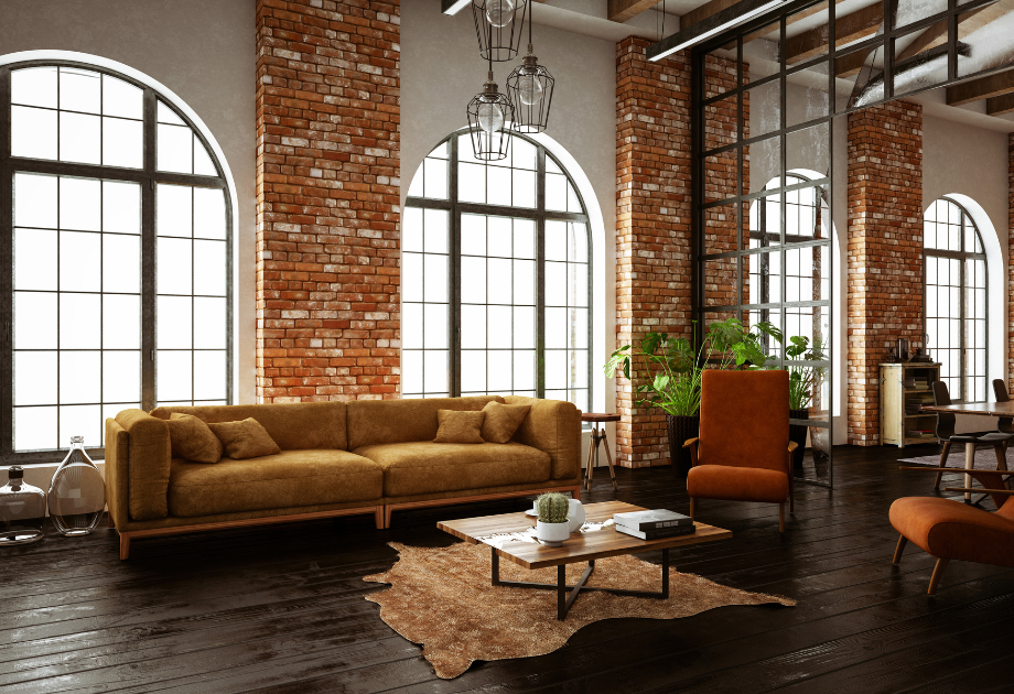
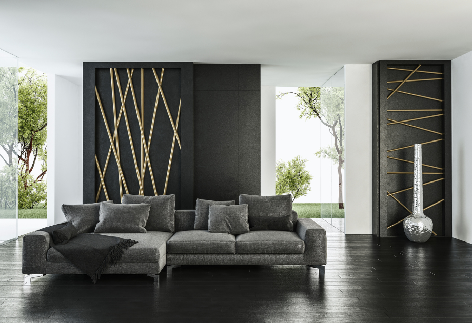
Bolder colors make their own kind of statement. Deep navy or black cherry adds drama without feeling overwhelming. Forest green or slate introduces an organic stillness that feels both earthy and refined. Terracotta and rust-toned floors create warmth with character, often reflecting a creative, collected style. Black or nearly black finishes feel powerful when used with intention, lending a room structure and anchoring the overall design with visual depth.
In interior design color theory, flooring sets the visual foundation. The 60/30/10 rule supports this by dividing a room’s palette into three parts. Flooring typically accounts for 60 percent, setting the base tone. The next 30 percent usually comes from furniture and textiles. The remaining 10 percent is made up of accents like artwork, lighting, and decorative accessories. Because flooring anchors the largest portion, its color influences how every other element comes together.
What Your Flooring Color Says About Your Style
Floor color sets the emotional tone of your space, and the right one often starts with how you want to feel when you walk through the door.
If you’re drawn to light and open spaces, pale wood tones like white oak or blonde maple reflect that sense of ease and clarity. Warmer tones such as golden brown, soft amber, or honey-stained planks often align with comfort, tradition, and a lived-in sense of welcome. Deeper shades like rich walnut or near-black oak tend to suit more structured interiors that emphasize contrast and balance.
For those who approach design as self-expression, bold colors like slate blue, forest green, or terracotta offer a way to bring personality into the room. These tones feel intentional and distinctive, adding richness that reflects your individual rhythm and taste.
There’s no single formula. Your flooring doesn’t need to match a trend or follow a rule. It only needs to support the way you want to feel in the space. If you’re not sure where to begin, start with the feeling. The color will follow. The next step is understanding how those feelings shift depending on the purpose and mood of each room.
Match the Mood to the Room
Every room has its own rhythm. Some invite conversation. Others offer rest. Some are built for motion, while others are made for stillness. Floor color can help guide those shifts without disrupting the flow of your overall design.
The following sections offer practical and inspired ideas to help you align flooring color with each room’s purpose and personality.
Bright and Airy Rooms
In naturally lit rooms, flooring should work with sunlight, not against it. Pale woods like white oak, soft ash, or lightly stained maple spread daylight across the room and create a natural sense of lift. The grain adds softness without weight, helping the room feel fresh and open.
These tones work especially well in open layouts and upper-level spaces where natural light is consistent. A matte or satin finish avoids glare and pairs beautifully with breezy curtains, light textiles, and minimalist décor. If durability is part of your decision, pale-toned luxury vinyl plank (LVP) or engineered wood with a wire-brushed texture offers resilience without compromising the look.
Small or Light-Limited Rooms
In rooms that lack sunlight or feel tight on space, the right floor color can shift the entire mood. Soft blondes, whitewashed finishes, or lightly weathered oak help reflect whatever light is available and give the illusion of openness. A gentle warm undertone can counteract the chill of fluorescent bulbs or north-facing windows.
Narrow plank widths can visually stretch the room, while low-contrast grain patterns keep things cohesive. In basements, hallways, or home offices, pale-toned LVP styled after sanded wood or driftwood brings a fresh feeling and holds up well in humid or temperature-prone areas.
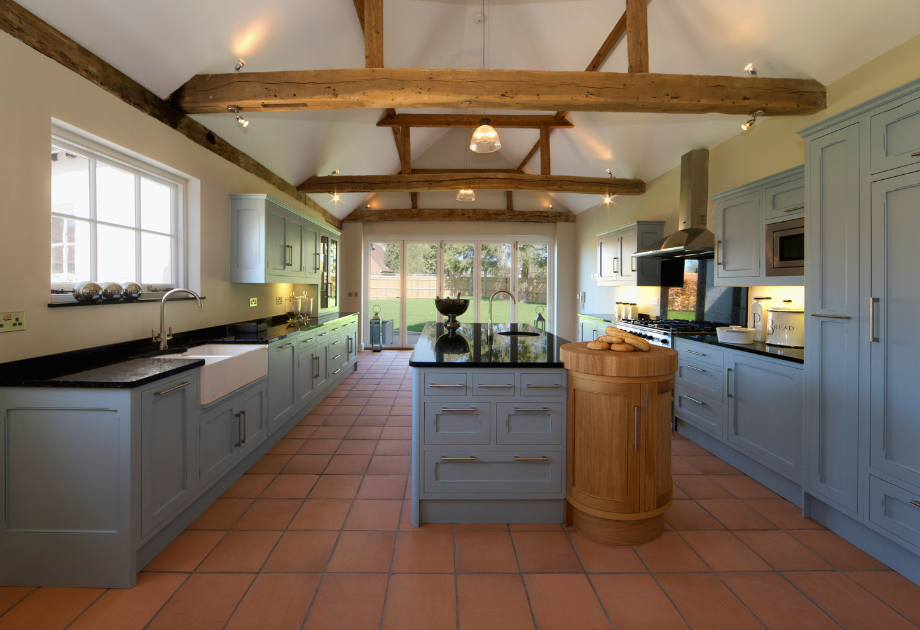
High-Traffic and Family Spaces
These are the rooms that carry the weight of daily life. Mid-toned floors with natural variation like hickory, acacia, or stained oak help disguise the evidence of pets, play, and busy schedules. Their patterns mask crumbs and scuffs without making the room feel dark or heavy.
Light textures such as wire-brushed or hand-scraped finishes add grip and hide dents. Rigid-core vinyl or waterproof laminate gives you a wood look that can handle spills, rolling toys, and shifting furniture. In playrooms, family rooms, or casual entryways, warm mid-tone LVP adds comfort without sacrificing style.
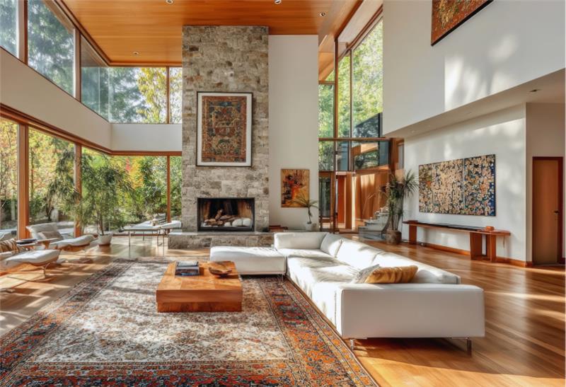
Formal or Statement Spaces
These rooms benefit from flooring that feels intentional and elevated. Rich walnut, deep mahogany, or espresso-toned oak create structure and style that hold their own beside dramatic lighting, sculptural furniture, or bold wall treatments.
Wide planks give a sense of scale in dining rooms, libraries, or front parlors, especially those with taller ceilings or crown molding. A satin finish adds a soft glow that catches the light without feeling glossy. For a bold twist, try deep gray, forest green, or even burgundy in high-end laminate or stained bamboo for a refined look with personality.
Transitional and Multi-Use Rooms
These spaces pull double or triple duty, so their floors need to feel balanced. Mid-tone browns, soft taupes, or greige tones pair well with a wide range of palettes, making the room easy to update over time. These colors stay grounded without locking the space into one look.
In guest rooms, offices, or flex spaces, subtle movement in the grain adds interest while staying neutral. Waterproof laminate or engineered wood with a low-sheen finish offers adaptability with polish. For a cozier feel, consider mid-tone carpet in a plush texture that invites both rest and productivity.
Find the Perfect Fit with A Step Above Flooring
The color of your flooring says a lot about how you want your home to feel. It sets the stage for daily life, bringing together light, texture, and movement in a way that feels natural to you. At A Step Above Flooring, we help clients find colors that match not only their vision, but also the way their space lives and breathes.
No two homes are alike. That’s why we take time to learn what matters most to you, offering personalized guidance based on your layout, lifestyle, and preferences. Whether you already have a palette in mind or want help narrowing things down, we’re here to make the process easier and more rewarding.
Browse our flooring selection or connect with our team to schedule a consultation. Let’s choose a color that supports your style and brings your home to life.