
Color Drenching Is the Design Trend Making Every Room Feel Like “You”
Color Drenching Is the Design Trend Making Every Room Feel Like “You”
.jpg)
What do interior designers know about choosing color that the rest of us don't? They choose a floor in the same color family as the walls on purpose. It's called color drenching, and it's having a moment in a big way. Zillow reports a 149% year-over-year jump in listings that name it. The reason it's everywhere is the same reason it works. Your home gets to feel like you live there.
So, what exactly is "color drenching"? This technique builds a room around a single color family. Walls, ceiling, trim, textiles, and the floor all share the same color story. The result is a room that feels coordinated from every angle.
That brings us to the floor. As the foundation of the color palette, it's the surface every other color in the room has to agree with. Coordination is the goal, not matching, and choosing the right floor is where the whole approach starts. That's where this blog comes in. We'll walk you through how to make your floor part of the color decision from the start.
(2).jpg)
How Color Drenching Works
Color drenching makes more sense once you understand the design ideas underneath it. There are only three concepts to know, and they're worth a minute of your time before we get into flooring.
Design Concept #1: Temperature
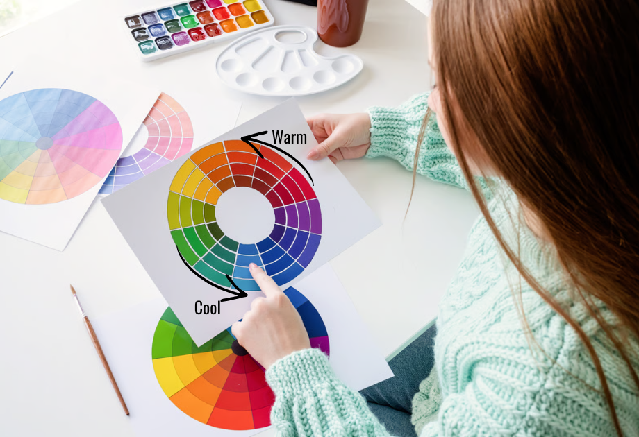
Every color has a "temperature." That's the design world's word for whether a color feels warm or cool. Reds, oranges, and yellows feel warm. Blues, greens, and purples feel cool. Even within neutrals, the temperature of the color decides whether two surfaces feel like they belong together. More on that, next.
Design Concept #2: Undertone
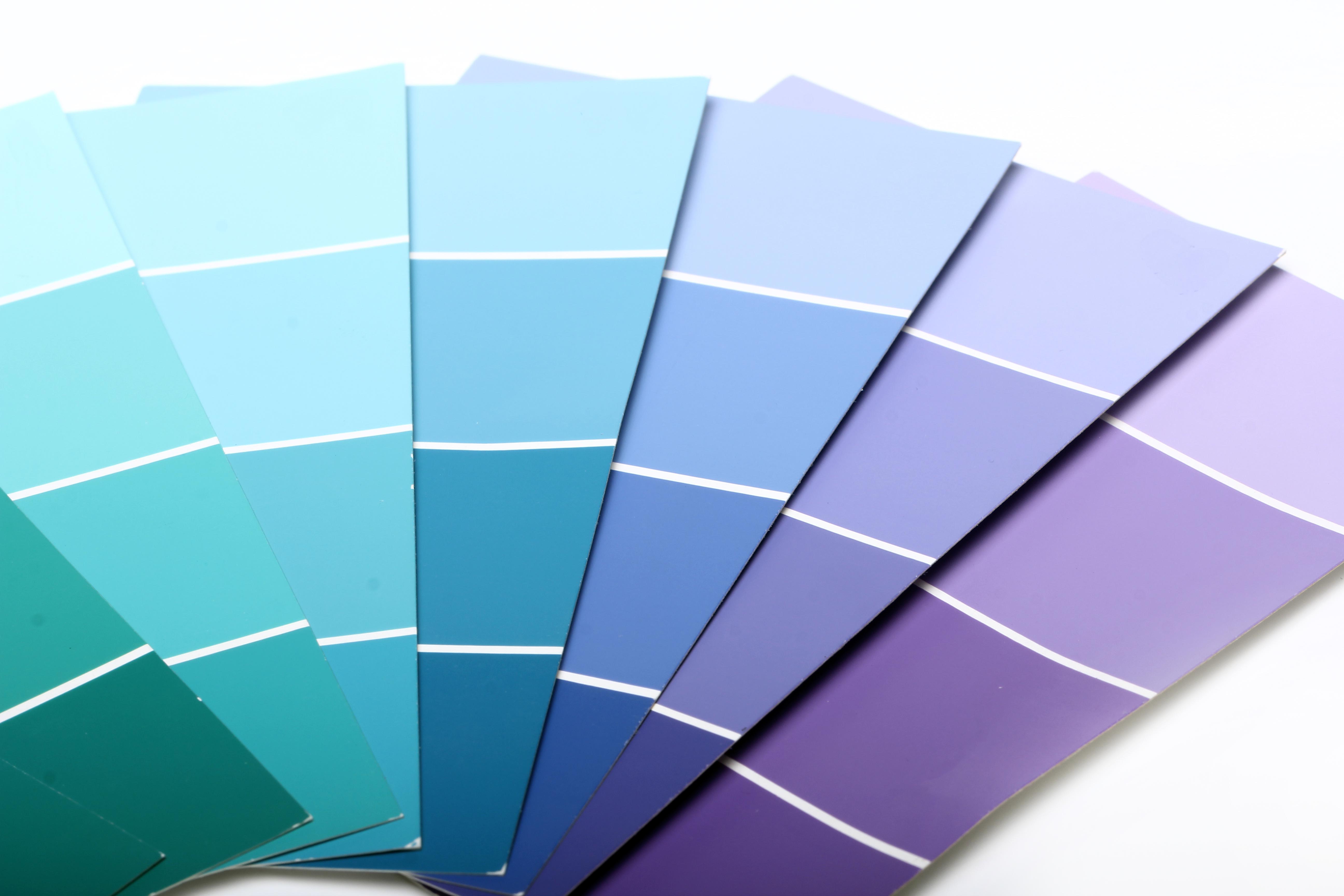
The reason a neutral can lean warm or cool is its undertone. An undertone is the subtle warmth or coolness sitting underneath a color's surface. A brown floor can lean warm (golden, honey, reddish) or cool (ashy, smoky, gray). The same is true for beige walls, gray tile, and almost every neutral in the room. Two surfaces with the same undertone settle into each other. Two surfaces with opposing undertones fight, no matter how beautiful each one is on its own. Knowing this helps you decide what to do with it.
Design Concept #3: Coordinating Over Matching
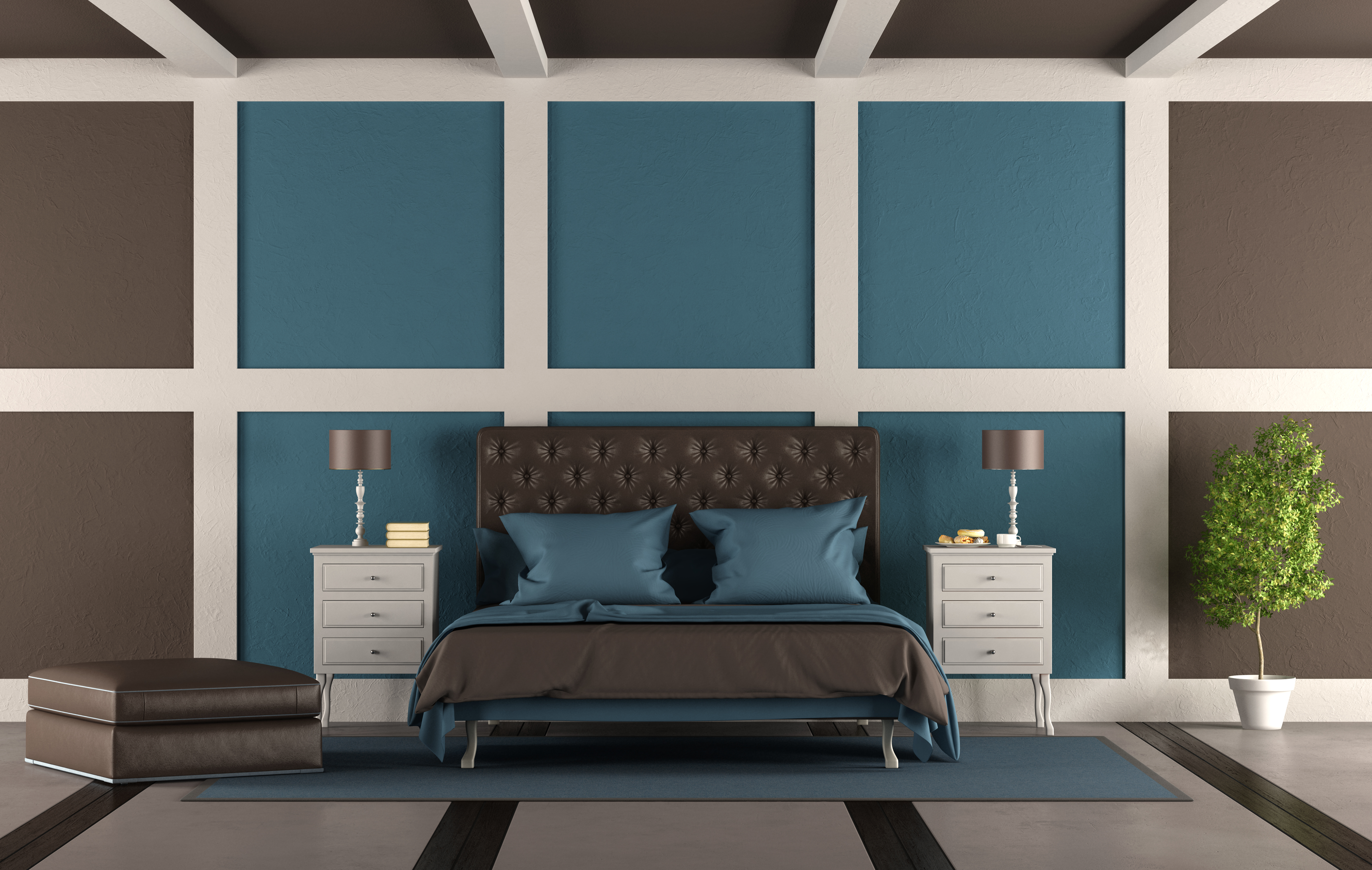
Color drenching is the design principle of coordinating undertones across every surface in the room. Coordinating is not the same as matching. Matching means every surface is painted or finished the same color, which usually makes a room feel flat. Coordinating means every surface in the room shares the same undertone family. The material, shade, and finish of each one can still be its own. That's the move that gives a color-drenched room depth instead of monotony.
Four Color Families and the Floors That Bring Them to Life
Now for the part where this becomes a decision you can make. Four color groups are showing up most in color-drenched rooms right now, and the floor that belongs underneath each one is different. The walls in your room can be repainted later if you change your mind. The floor can't. So before you commit to a color story, it helps to know which floors are going to work with the colors you love. Here are the four groups, and the floors that bring out the best in each.
Warm Earth Tones
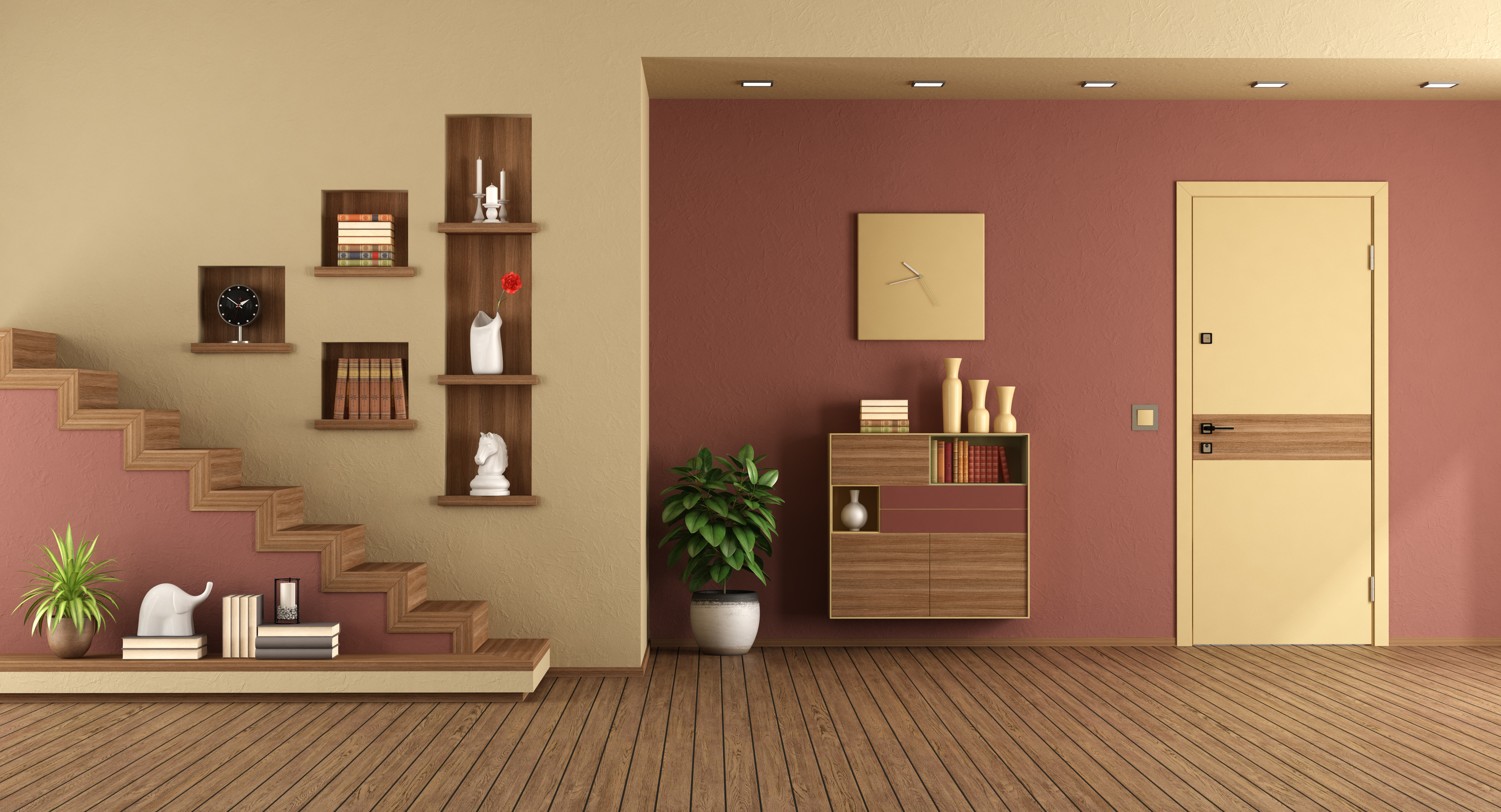
Terracotta, clay, rust, and mushroom palettes pull their energy from the natural world. A room drenched in this family feels organic and collected, like something built up over years rather than decorated in a weekend. The floor should feel like it came from the same place.
Medium-tone hardwood with visible grain is the closest match. Chestnut, caramel, and honey shades carry warmth and texture in the same breath, which keeps the floor in the same conversation as the walls. Wood-look LVP carries similar warmth at a different price point. Warm-toned tile in clay or sand finishes works beautifully when stone makes more sense than wood for the room. Matte and wire-brushed finishes echo the imperfect, hand-touched quality these palettes love.
What to avoid: cool-gray hardwood or polished black tile would pull the room out of the warm, organic world the walls are building.
Cool Blues and Greens
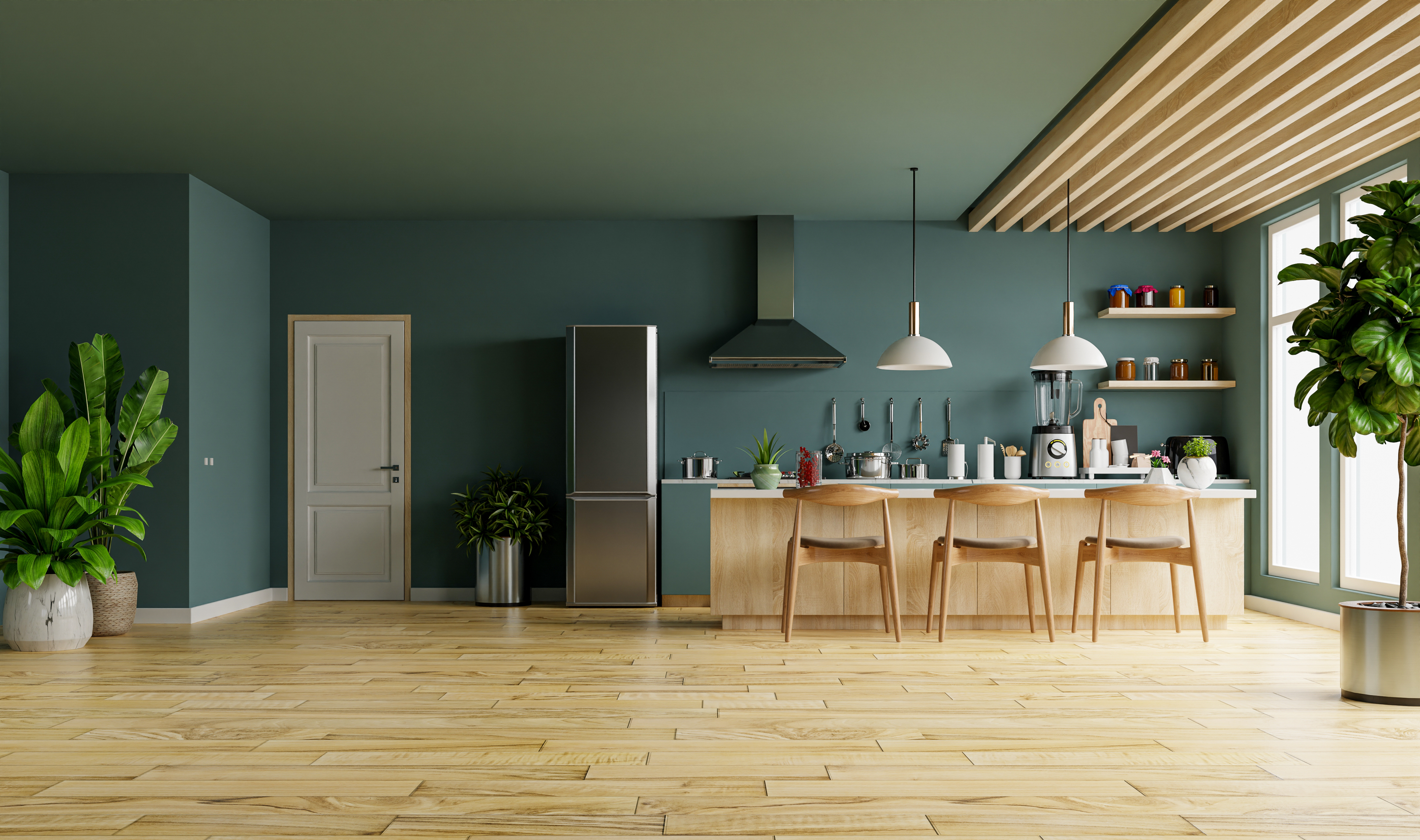
Sage, jade, teal, and navy palettes range from airy to cocooning depending on how saturated the walls are. A pale sage room reads open and quiet. A deep teal room reads enclosed and intimate. The floor's job changes with the depth of the palette, but the goal is the same: warmth has to come from underfoot, because cool walls won't bring it on their own.
For pale, cool palettes, lighter, warm woods are the right call. White oak with a natural finish, or rift-sawn ash, bring warmth without weight. The room stays airy, and the floor reinforces the openness the walls are already creating. Stone-look tile with warm undertones in its veining works for the same reason.
For deep, cool palettes, the floor has more visual weight to balance. Espresso and walnut are warm woods at their core, with undertones that run brown, red, and gold. The depth of these woods lets them hold their own against the saturation of deep teals and forest greens. A lighter, warm wood wouldn't carry enough visual weight to balance walls this saturated.
What to avoid: cool-toned, dark woods or anything with a gray-washed finish. Those would only deepen the chill the palette is already drifting toward.
Jewel Tones and Deep Color
.jpg)
Plum, crimson, espresso, and dark green palettes deliver drama. A jewel-toned room feels enveloping and intentional, the kind of space that wraps around you the moment you walk in. The floor's job is to give the room breathing room so the saturation doesn't close in.
Maple, ash, and bleached oak are the woods that earn their spot here. They're light enough to give the eye somewhere to rest in a saturated room. Their cooler undertones keep them from competing with the deep colors on the walls. Stone-look tile in a tonal shade slightly lighter than the walls keeps texture in the room without adding weight. Carpet works too, especially in bedrooms and studies. A tonal shade one step lighter than the walls softens the edges of the room without breaking the color story.
What to avoid: a warm, honey-toned wood would feel like it belongs to a different room. A floor in the same depth as the walls would close the space in completely.
Soft, Warm Neutrals
.jpg)
Cream, warm ivory, and cloud palettes are the family that reads gallery-like and relaxed. The walls are restrained on purpose, which leaves the floor to carry most of the room's character. Material, texture, and finish are what give the eye something to hold onto.
Warm hardwoods like white oak, hickory, and walnut all earn their place here. The depth of the wood gives the eye something to anchor to in a palette this soft. Natural stone like limestone or travertine works for the same reason. The veining and variation in the stone add dimension that the walls aren't providing on their own. Wood-look LVP is another option, as long as the finish has enough variation across the planks to keep the floor from reading uniform.
What to avoid: cool-toned floors and flat, uniform finishes work against this palette. When the walls are this restrained, the floor needs warmth and variation to keep the room from feeling washed out.
In a soft neutral room, the floor becomes the personality of the space in a way it doesn't have to be in louder palettes. Whichever direction you're drawn to, the floor is what holds the color story together.
A Step Above Flooring Helps You Find the Floor That Completes Your Palette
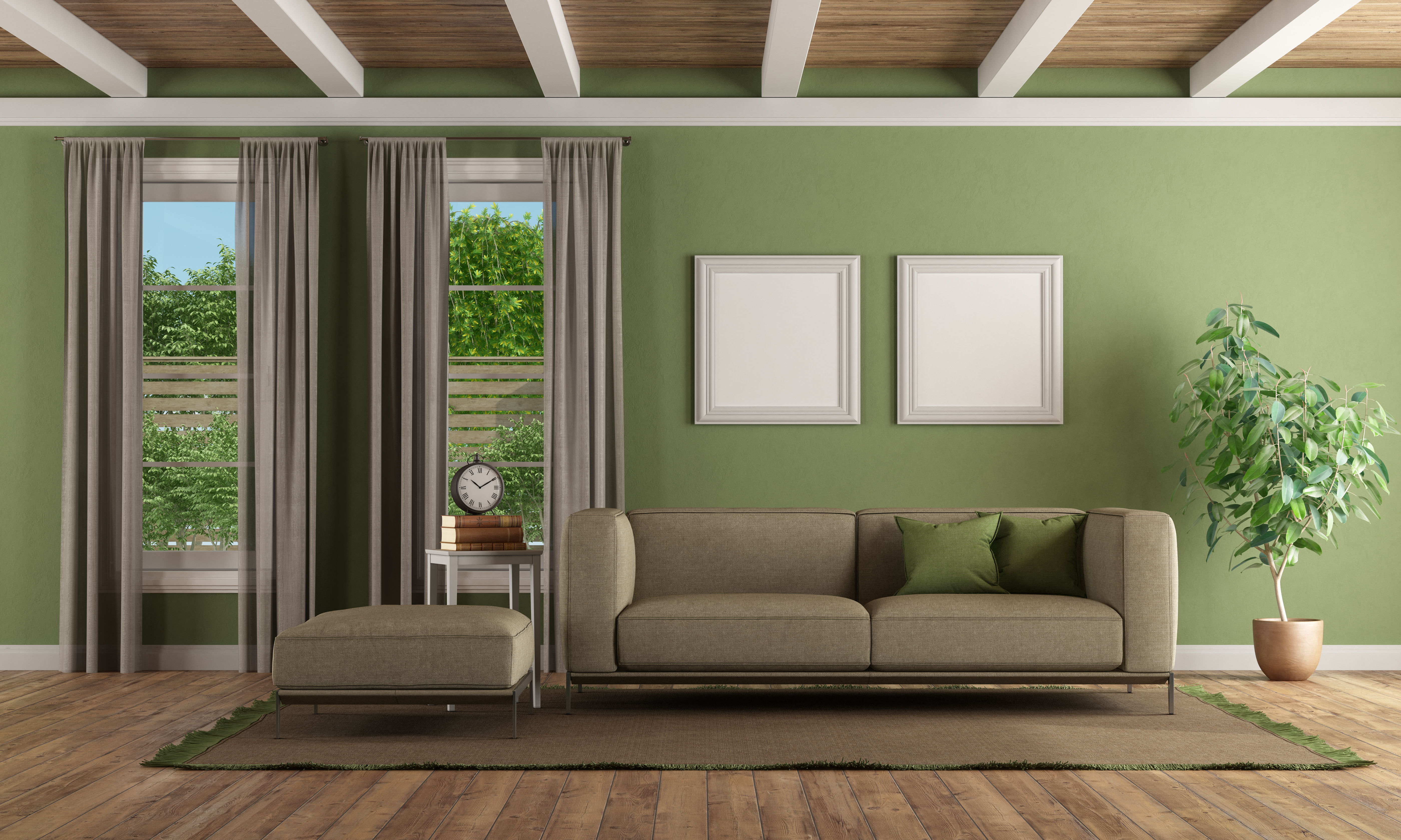
Your color story might lean warm, cool, jewel-toned, or soft. You have a direction in mind. We have the showroom, the brand partners, and the installation experience to back the choice you're making. Our team works through color decisions with homeowners and designers every day. We've been doing it across Southwest Ohio and Northern Kentucky for over thirty years. We know how to pair a floor with the rest of the room so every surface in the space belongs to the same color story.
Tell us the color story you're building. We'll walk you through hardwood, tile, LVP, and carpet options that fit it. Schedule a consultation with our team and bring your color vision. We'll handle the floor.