Making the Case for Contrast with Light and Dark Floors at Home
Making the Case for Contrast with Light and Dark Floors at Home
.jpg)
Designers and influencers of every sort all agree that 2026 is the year to be unapologetically you. It’s time to celebrate your unique personality, and that includes the spaces you live in, too. Gone are the days of beige and gray, which ask your spaces to fade politely into the background. This is the year to confidently make your home reflect your taste, preferences, and style. And we recommend starting with your floors.
Bold style choices don’t have to overwhelm a space or feel like a short-term fad. One of the most effective ways to add personality while keeping a home grounded is through contrast. Pairing light and dark flooring throughout your home introduces depth, variation, and visual interest without relying on statement pieces or overly dramatic finishes.
This blog explores how light and dark floors work together across a home, how contrast influences mood and layout, and what to consider when making flooring decisions that feel confident now and flexible for the future.
Create Drama That Still Feels Livable
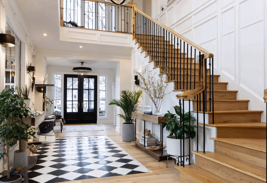
Contrast has a reputation for feeling bold, even risky. Light and dark floors in a home can sound like a commitment to something stark or visually demanding, especially when carried throughout a home. But contrasting floors can bring drama to your home without being overpowering.
Drama doesn’t require extremes. It comes through contrast used with control. Light and dark floors define shape, sharpen transitions, and create emphasis without relying on decorative excess. This is what makes contrast compelling. For homeowners drawn to drama, it’s a way to give each space a clear identity. Rooms feel structured. The layout gains rhythm. Light and dark move through the home with intention, creating variation that feels designed rather than improvised.
Applying this well is less about bold moves and more about placement. Lighter floors tend to suit open, active areas where movement and energy matter. Darker floors bring weight to spaces designed to slow things down. When the contrast comes from layout, not loudness, the result is drama that reads as intentional, livable, and clearly designed.
Use Light and Dark Floors to Shape Mood and Movement
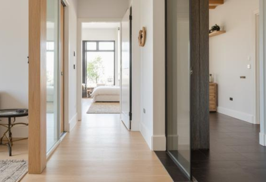
Beyond appearance, contrast affects how a home feels as you move through it. Light and dark floors influence energy, pace, and atmosphere in ways that register immediately, even if they aren’t always consciously noticed.
Lighter floors tend to lift spaces. They keep kitchens, living rooms, and connecting areas feeling open and fluid, supporting movement and conversation. Darker floors introduce visual weight. They slow the pace slightly, giving rooms meant for focus or gathering a more settled presence.
As those tones shift from room to room, they create rhythm across the layout. Lighter floors extend sightlines and reinforce continuity between spaces. Darker floors define transitions and moments of arrival. The change doesn’t interrupt the flow of the home. It helps organize it.
Contrast works when flooring decisions are made for the layout, not just the room. These shifts in tone give each space a different role to play, and that structure creates room for personality to come through. Movement becomes part of the design language. The result is a home that feels cohesive, with transitions that reflect how the space is meant to be used and how you want it to feel.
Balance Light and Dark Floors Through Color and Material Choices
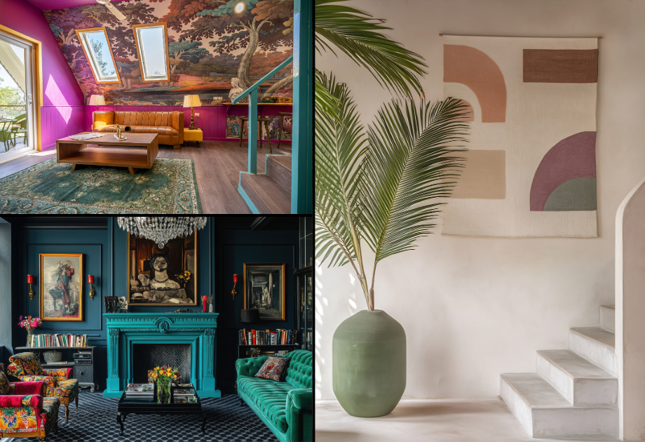
Personality isn’t just expressed through floor color. It shows up in the full palette: walls, trim, cabinetry, and every finish that surrounds the space. That’s why contrast underfoot works best when it’s coordinated with the rest of the home, not treated as a standalone feature.
Tone, temperature, and undertone all affect how a floor reads in context. A dark wood with cool undertones will land differently next to a warm white wall than it will beside soft gray cabinetry. These relationships are what keep contrast from feeling abrupt. When the palette is aligned, contrast adds complexity without creating conflict.
This kind of control gives you more room to be expressive. It supports bolder flooring choices without losing balance. You can use richer tones, sharper shifts, and deeper variation when the surrounding elements support them.
Finish and texture also shape how contrast feels over time. Glossy, matte, or textured floors will reflect light differently, shifting the way depth and definition come across in daily use. Choosing a finish you’ll love living with helps the contrast stay readable without becoming harsh or demanding.
To make that happen, choose a direction early. Decide if the palette leans warm or cool, and carry that tone across your light and dark flooring selections. Echo those same tones and textures in fixed elements like cabinetry, trim, or nearby finishes. That structure keeps the layout cohesive, even when the contrast is strong.
Let Scale and Proportion Guide Floor Contrast
Personal style doesn’t show up the same way in every room. A choice that feels bold and balanced in a large space can feel heavy or abrupt in a smaller one.
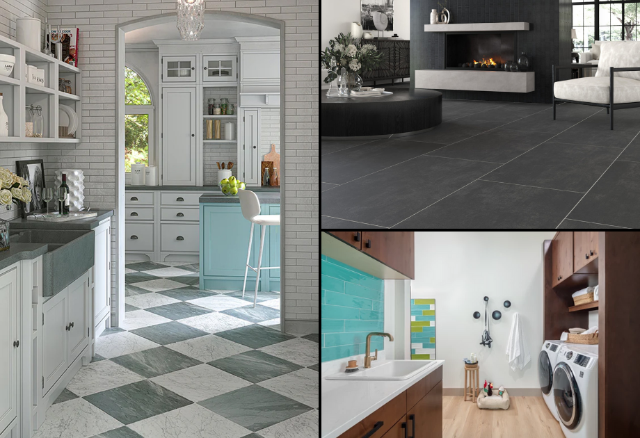
That’s where proportion becomes part of the design. Room size, ceiling height, and layout all affect how contrast reads. A darker floor carries more visual weight in an expansive space than it does in a compact one. In smaller rooms, contrast makes a stronger statement, so placement matters more.
This is how style adjusts without losing cohesion. Letting light and dark flooring respond to the space allows each room to express something different while still feeling connected. Larger rooms can support deeper tones. In smaller or transitional areas, contrast works best when it defines function and helps one space flow into the next without blending them together.
Open layouts often benefit from subtle zoning. A shift in flooring can help define one area from another while keeping the full space visually continuous. In rooms with generous proportions, using deeper tones alongside lighter vertical surfaces adds clarity without compression.
Design Confidently with A Step Above Flooring
Light and dark floors bring structure, movement, and mood to a home. They define space with purpose. They shape how rooms feel individually and how they relate to each other across the layout.
This kind of contrast supports style with presence. It gives each room a clear identity and lets personality carry through without losing connection. Homes feel expressive, not accidental. That clarity comes from thoughtful decisions made early about placement, materials, and how the design comes together as a whole.
We help bring that vision into focus. Our team guides floor planning, finish selection, and material coordination to support bold ideas that feel livable every day.
Step into 2026 in a style that celebrates your space and personality. Contact us to start the conversation.